When visitors first look at your webpage, they often do a quick visual scan to learn what it is about. This scannability is important for making content-rich pages more readable. A key way to make documents and web pages scannable (both visually and by screen reader software) is by using the correct structural pieces, such as headings and lists.
Headings
What Makes a Real Heading?
To make it possible for screen reader software to quickly skim your page's content, you need to provide a not-just-visual outline of your page by using headings. Adding headings allows this software to quickly scan the page for users with visual challenges, and reads the headings aloud, so they can skim a page just as one might do visually.
Headings are not the same as visual changes in size or color, but have special code behind the scenes. This means you cannot make text bold and have it work as a heading.
How to Add a Heading
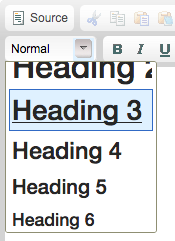
To make a real heading, first, highlight a line of text on your page that indicates another section or division of content on the page. Then, in your editor's toolbar, select the "Format" option in the toolbar.
![]()
A list drops down underneath "Format" and offers you a number of options, but the most important for your outline are these four:
- Heading 3
- Heading 4
- Heading 5
- Heading 6
Why Heading 3 and then Heading 4?
Because of the templates used by most websites on campus, Heading 1 is already used in the branding area at the top of the page and Heading 2 is used for a web page's title. All the rest of your content falls underneath that page title in your outline, so you should start at the Heading 3 level within that page's content.

You should not use a Heading 4 unless you've already entered a Heading 3, since screenreaders expect headings to be used sequentially, or in order. Unless your pages are very long, you will probably only use the "Heading 3" and "Heading 4" options with any regularity. If your content is all at the same level in the outline, you can use multiple Heading 3 elements.
Lists
Like headings, lists are more than just visual changes, such as indented text or circular images at the start of a line.
![]()
Lists can be a good replacement for simple tables, as they are easier to navigate than tables.
Use different types of lists to group information according to its nature to provide orientation for users.
- Unordered lists are used when the order of the items is not relevant. List items in unordered lists are marked with a bullet. (Example: ingredients in a recipe)
- Ordered lists are used for sequential information and are automatically enumerated by the browser. (Example: steps in a recipe)